Benefits and examples of accessible web design
Learn why web accessibility should be a priority for your business and see which websites are getting it right with Ten10 Principal Consultant, Charlotte Hayes
Web accessibility is a priority for companies who want to ensure they’re making their products and services easy for everyone to use, and aren’t excluding any potential customers or users. There are many financial, legal, usability, and moral benefits which should be on every company’s roadmap to ensure full accessibility for their customers.
In the UK it is thought that some seven million people of working age have a disability. The spending power of those people is known as ‘the purple pound’, and is currently estimated to be worth £274 billion per year to UK businesses (as of 2020).
A common mistake is to leave accessibility validations until just before a product’s launch, believing there will be little risk or impact. But research from change programme Purple Tuesday, suggests UK businesses lost more than £411bn during the pandemic due to accessibility issues. Accessibility should not be an afterthought and be built into the initial discovery and design of project delivery.
Here are the common benefits of accessible web design, with five examples of companies who are getting web accessibility right.
Benefits of accessible web design
Benefit #1: Accessibility broadens your market
The first benefit is a no-brainer: if a website is fully compliant with the web guidelines (to at least WCAG 2.1 AA level) your company will have broader market penetration as people with any impairments will be able to fully access the site or application. The more customers you reach, the greater revenue you can create.
One example is enhancing your website to be compatible with assistive technologies that help customers with sight impairments navigate around the site and understand the content (including links, buttons and forms).
Benefit #2: Accessibility means you avoid reputational damage and legal complications
Some businesses are not fully aware of the implications of having a website that is both difficult to navigate and non-compliant. If your website or application is not compliant with the web standards then your business or organisation may be subject to legal complaints. This is especially pertinent for projects within public sector organisations. Raise your awareness by reviewing all the WCAG 2.1 standards.
You can stand out from your competition by demonstrating corporate social responsibility. Writing a statement to highlight your commitment to web accessibility can bring the following benefits to your company:
- Enhanced brand image and reputation
- Increased sales from customer loyalty
- Improved ability to attract and retain employees
Benefit #3: Accessibility can improve your SEO
Increasing your search engine optimisation (SEO) helps drive more traffic to your site and makes your site more usable. While accessibility itself is not a specific ranking factor (because ‘accessibility’ cannot be quantified), good accessibility practices can have a positive effect on Google ranking factors. For example, Google values how long people spend on your site when they come from a Google search. A positive, easily-readable user experience positively affects your SEO.
Your organisation’s marketing team will benefit from making accessibility part of their digital foundation to ensure the following features that could improve your SEO are included:
- Inserting non-text content such as alt text to properly label images makes your website more searchable and be compatible with assistive technologies
- Adding keywords into links such as more information pages and images
- Ensuring all videos within your website have the ability to add transcripts and closed captions so that people with hearing difficulties can still understand the content on the site – transcripts also provide text that can be discovered and indexed by search engines
- Ensuring your entire site is mobile friendly – the number of sites accessed by mobiles continues to increase
Benefit #4: Accessibility builds a positive brand for your company
You should not underestimate the impact accessibility can have on your brand. Much has been written about the increasingly socially conscious consumer and just as people look for companies with economic, social and environmental commitments (ESG), they are more likely to buy from someone who has a powerful mission statement to accessibility.
Signposting the changes you have made to comply with the WCAG 2.1 projects a positive brand image and means customers who rely on your accessibility features are may more likely to recommend you to their family and friends as a responsible seller.
Five examples of accessible web design
Below are some of the best examples of companies promoting good web accessibility:
Example #1: Skip to content button
One principle of good web design is ensuring that there is a ‘skip to content’ button at the start of a webpage where you have many different headings and sections. This button helps keyboard and screen reader users find the content of a page quickly. It also becomes visible when the user of the site uses their keyboard to tab across content. See below how the BBC website’s skip content button becomes visible to allow a user to skip all the navigation items and jump straight into the content they need:

There are many websites that have now incorporated the skip to content link such as:
To add further accessibility compliancy a website can have ‘skip to link’ buttons included in the page design which allow a keyboard and screen reader user to skip to the footer navigation at the bottom of a webpage.
Example #2:
Another principle of accessible web design is contrast. Websites must have a minimum specific ratio of contrast as per the WCAG 2.1 guidelines in order for the page to be read and be visible for colour-blind and visually impaired users.
The majority of companies test their website to level AA compliance, this guideline states the minimum ratio for text and images that have embedded text with font size below 18pt should have a ratio of 5.4:1 or higher. An example is this image below has a ratio of 8.01:1 as the foreground and the background colours are clear enough for people with sight impairments to view:

You can use a contrast checker such as the one below from WebAIM to calculate the ratio, which takes the hex value of the foreground and background colours.

There are, however, five different contrast ratios to adhere to depending on your font size or web content level adherence.
Decorative elements such as a logo or brand name have no contrast requirements. Meeting the contrast criteria can be difficult for some companies as their branding colours may not meet the web content guidelines and therefore have more of an impact to get this changed. Below is the gov.uk website, which shows good contrast ratios. They mainly use black, white and blue across the whole of the site which makes it 100% accessible.

Other examples from companies who have good contrast ratios are:
Example #3:
Focus order for keyboard users is an important aspect to include in a website but is often overlooked. Imagine you can’t use a mouse and you have to use the tab key to navigate your way through a website. Imagine losing where you are on the site: where is the pointer being highlighted? Without the pointer being visible on each section, the user will have no idea where they are on a page.
An example of where this is used well is Amazon. As you can see, page focus is visible by the clear orange box around the section the tab key has focussed on.

This allows the user to select that focus area or move between sections. This works well with assistive technology such as screen readers for users that might have a sight impairment.
Other examples of good use of focus being visible are:
Example #4:
One key area of accessible web design to consider is ensuring assistive technologies can be used across the site. Screen readers and text-to-speech software are very popular and widely used by people with various impairments. Here are some features that can be used to ensure screen readers can navigate across a website:
- Ensure you properly label buttons and links so screen readers can read the label and know what they are selecting or focussed on.
- Avoid elements that require you to hover over with a mouse as this cannot be easily done by people with sight impairments.
- Try not to set any audio content playing automatically when logging onto a page. Allow the user control to stop, start, pause, and adjust the volume as often this audio can drown out the screen reader’s voice and make it hard to understand the rest of the site.
- If pop-ups are used across the site, make sure they are on top and the screen reader focuses on them first. But remember: using many pop-ups can make the user experience frustrating.
- Make sure your site’s content is clearly structured with heading tags so screen readers can easily move between them.
Example #5:
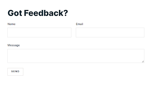
The last example of accessible web design concerns designing website forms. These are an often-overlooked element and can easily become non-compliant with the web guidelines and are especially incompatible with screen readers.
A typical form should incorporate five elements:
- Structure of the fields in a logical order
- Fields designed for user input, such as password fields
- Labels to explain what the fields are for
- The call to action button when submitting data
- Feedback messages to the user for both positive and negative scenarios
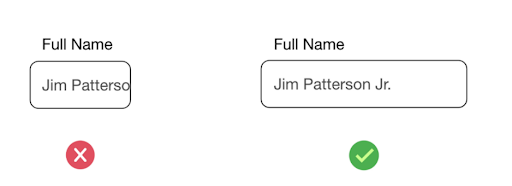
Here is an example of the use of fields lengths for forms:
Another example below shows a form which is free from distracting elements (such as too much information) that can push a user to abandon the page in frustration.
You may find that improving your forms from an accessibility perspective will improve their overall performance. The principles that improve a form’s accessibility (such as a logical order of fields, explanation of each field, and a clear call to action button) can lead to higher conversion rates, increased revenue, and happier customers.